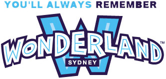
In reviewing the existing Wonderland Sydney logo a number of issues were discussed:
1. Legibility.
It was felt that the word and, in particular, the closeness of the letters made the existing logo difficult to read.
2. Colours.
The use of multiple colours and dark lines in the logo contributed to its illegibility and made it look dated, with a cartoon feel that didn't represent the quality or broad appeal of the Wonderland Sydney brand. So, in the new look logo, a number of components have come together to create a contemporary branding concept.
3. The introduction of the 'W' icon device.
In a worldwide review of Theme Parks it was seen that most had a 'symbol' which represented the property. Disneyland with its Castle. Alton Towers with its Tower. Universal Studios with the Globe.
The introduction of the 'W' icon now means that Wonderland Sydney too has its own icon which can be used to help strengthen the brand in all communication. It also works brilliantly to highlight the exact location of the park.
4. Subtle separation of the letters to make the word more legible.
The simple addition of more letter space has opened up the word which inturn makes it more legible, particularly from a distance.
5. The introduction of a new colour palette.
Blue was chosen as the main corporate colour because of its vibrance and strength. It also has timeless, contemporary quality. A darker blue forms the outline of the letters, while the use of white in the interior space (as opposed to the darker outline and dark fill of the existing logo) makes it clean, crisp and modern. It is also possible to express the logo in different individual colours to reflect the “lands†within Wonderland Sydney. This could be used for themeland specific promotions - ie: Transylvania would be red, the Beach in aqua etc. However, the main Wonderland Sydney colour will be the blue.
4. Adding a curve of the word Wonderland .
The purpose of curving the lettering is to lift the word away from the W icon as well as giving it more dimensional form and function. It makes the logo more fun, while helping to make it feel bigger and more worldly. It too adds a much more contemporary strength to the overall logo design.
The end result is a new logo look for Wonderland Sydney which is stronger, simpler, more worldly, less cluttered and a much more contemporary piece of design.


